PROJECT
JetBlue Card Rewards Guide
CATEGORIES: Websites, Prototyping, Motion Graphic
ROLES: Art Director, Designer
YEAR: 2019
READY TO TAKEOFF
As a stylish and sophisticated aviation brand, JetBlue is known for their witty, playful and approachable brand voice. When they need to create awareness of their loyalty program, it’s important to emphasize friendliness and approachability. Our team was approached by Barclays to create a 360º campaign for the JetBlue card suite.
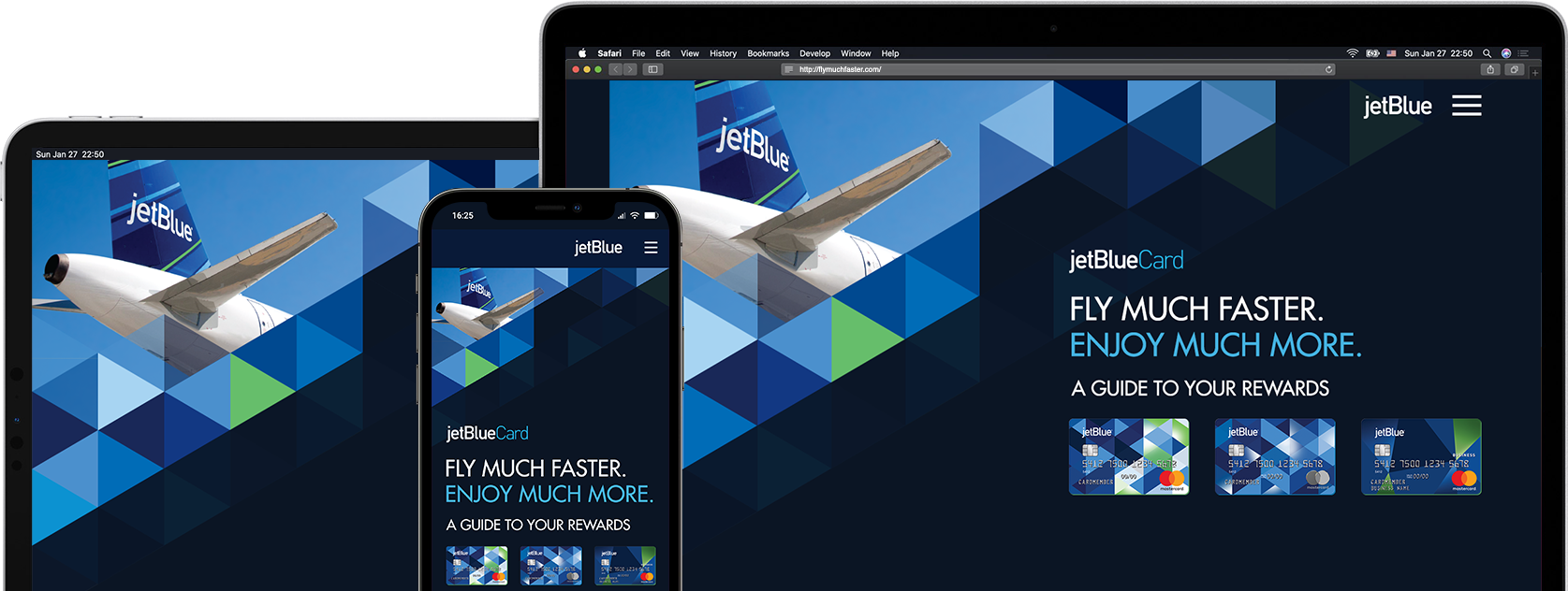
Since our target audiences are frequent JetBlue flyers, we created an interactive visual journey as rich and dynamic as a real JetBlue inflight experience: fast, smooth and full of joy.
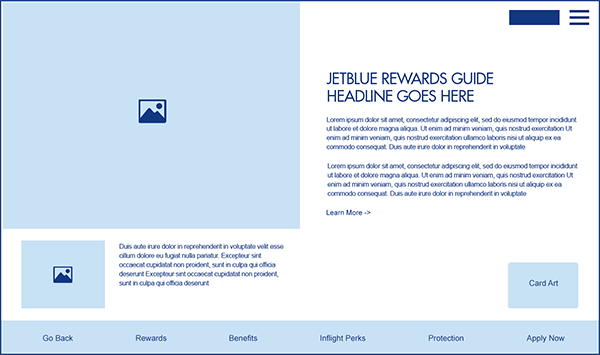
AN USER-CENTRIC NAVIGATION
We started the design process by analyzing both the brand and the target audience.
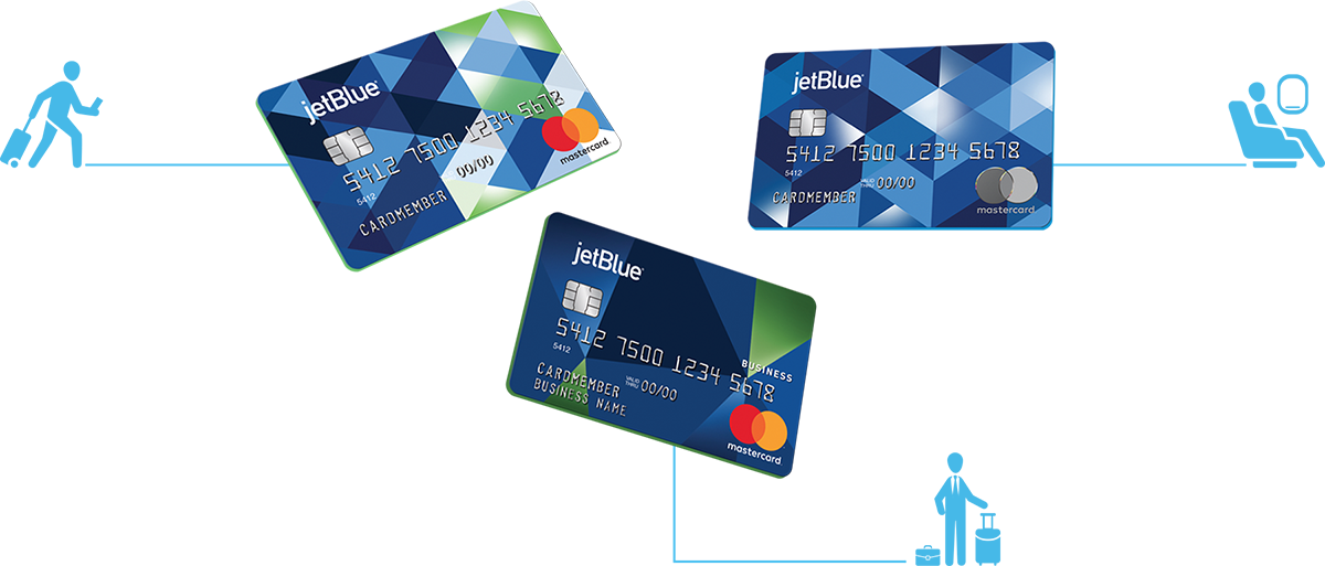
Brand: JetBlueCard is an award winning travel rewards program that offers fast and easy ways to earn points from daily purchases.
User: JetBlue flyers are adventurous flyers who look for exciting vacation spots, travel perks and ongoing savings.
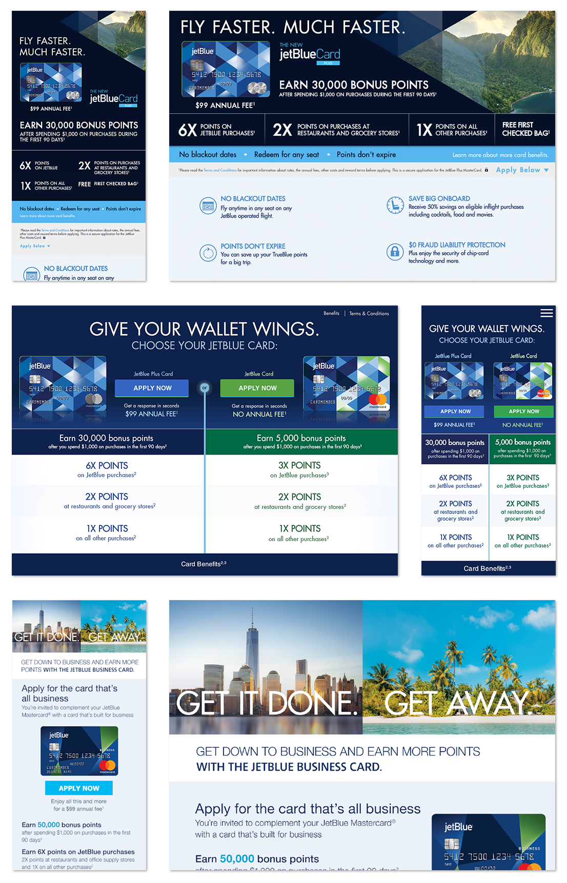
To conclude, it’s important that our design language has a strong JetBlue presence: simple, stylish and on brand. It is even crucial that users can easily find out all the rewards and benefits information without too much digging. We created a site navigation that cater to 3 different types of customers needs: general cardholders, frequent flyers and business individuals.
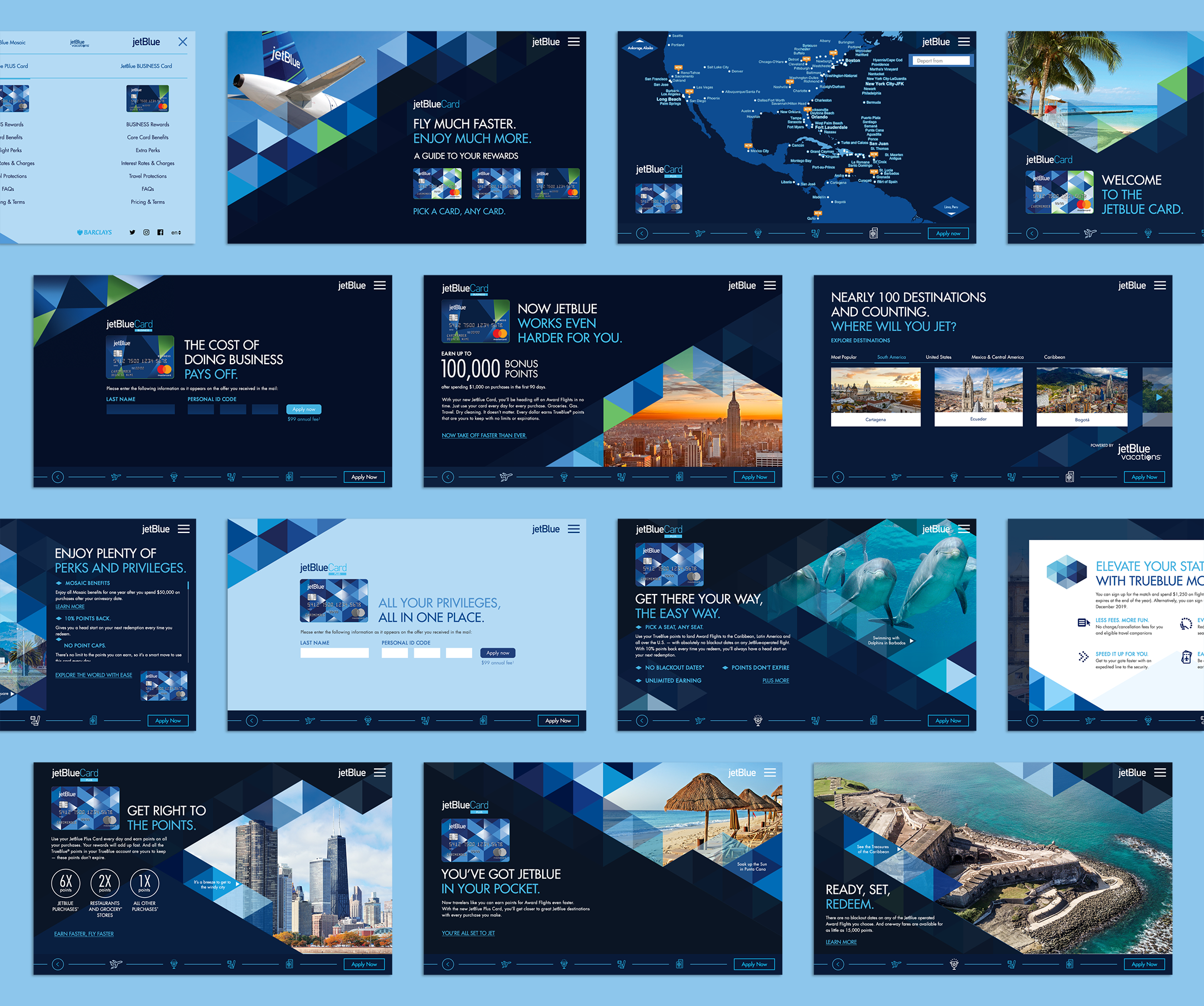
AN INTRIGUING VISUAL LANGUAGE
The visual presentation is inspired by the triangle patterns from the JetBluecard itself, laid out starting from the grid — shades of blue from the palette along with splashes of green. Opacity and effects are used over the photo background to create intrigue atmosphere. Solid diamond shapes were created as color blocking.

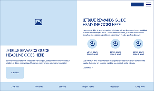
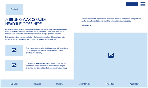
A SWIFT LAYOUT SYSTEM
We implemented a swift sliding motion in between frames and sections to enhance the journey movement and highlight the important card features. Layout designs not only ensure the audience gets the information they need instantly, but also leave enough negative space to ensure the site is visually stunning.
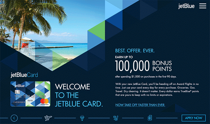
A SITE EXPERIENCE THAT EMBODIED FLIGHT EXPERIENCE
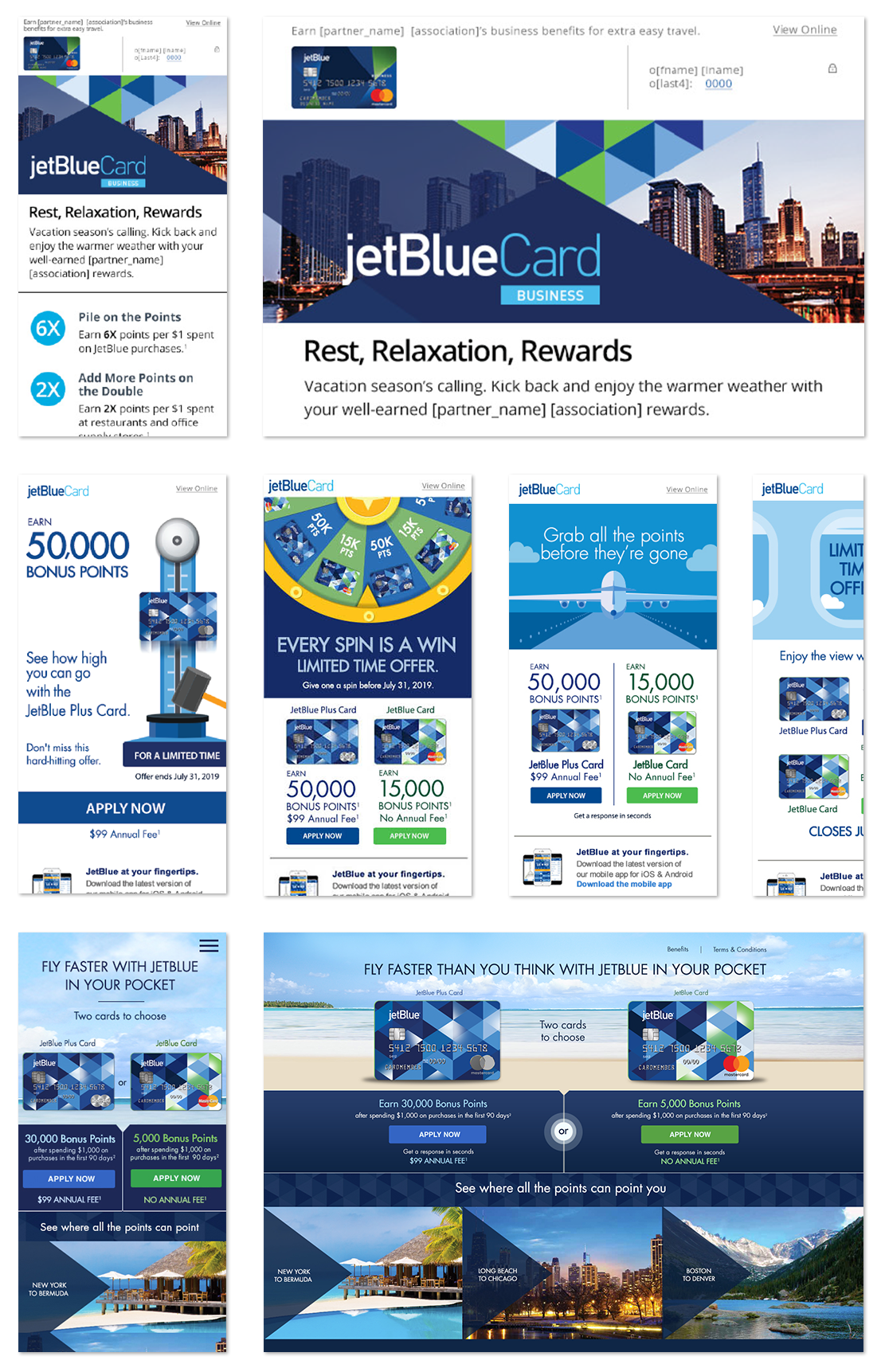
Instead of a page stacked up with card features, we created a fun, interactive, easy to navigate Microsite that follows a journey path. It waves in travel perks and benefits with some of the signature travel destinations JetBlue vacationers are drawn to, using visual language to mimic the smooth transitions between different benefits sections. We even created an interactive destination map for users to easily calculate the amount of points they needed to reach their destination with JetBlue.
For the purpose of a frictionless user journey, we avoided heavy written content to improve user accessibility, instead focusing on core campaign messages and visual engagements, integrating a variety of elements to grab attention.
Play the video to see the site experience:
A SITE EXPERIENCE THAT EMBODIED FLIGHT EXPERIENCE
Instead of a page stacked up with card features, we created a fun, interactive, easy to navigate Microsite that follows a journey path. It waves in travel perks and benefits with some of the signature travel destinations JetBlue vacationers are drawn to, using visual language to mimic the smooth transitions between different benefits sections. We even created an interactive destination map for users to easily calculate the amount of points they needed to reach their destination with JetBlue.
For the purpose of a frictionless user journey, we avoided heavy written content to improve user accessibility, instead focusing on core campaign messages and visual engagements, integrating a variety of elements to grab attention.
Play the video to see the site experience:
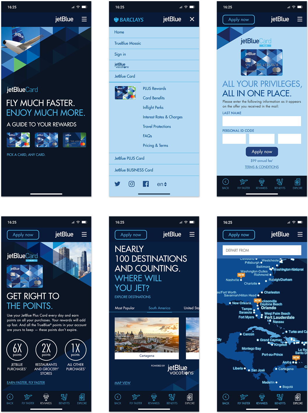
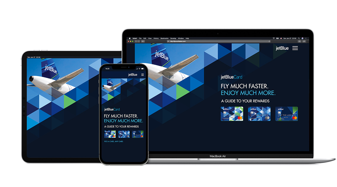
A DIFFERENT SOLUTION FOR MOBILE
By taking careful consideration to ensure the microsite was optimized for multiple devices, the mobile experience retains the same site structure, however eliminating the animation, decreasing the load time for mobile and keeping it simple and easy to use.
RESULTS
The campaign not only drove mass awareness of JetBlue’s loyalty program but also increased booking intent and attachment of fliers' unique loyalty number to their upcoming booked flights. Also successfully increased traffic to the JetBlue vacation site.
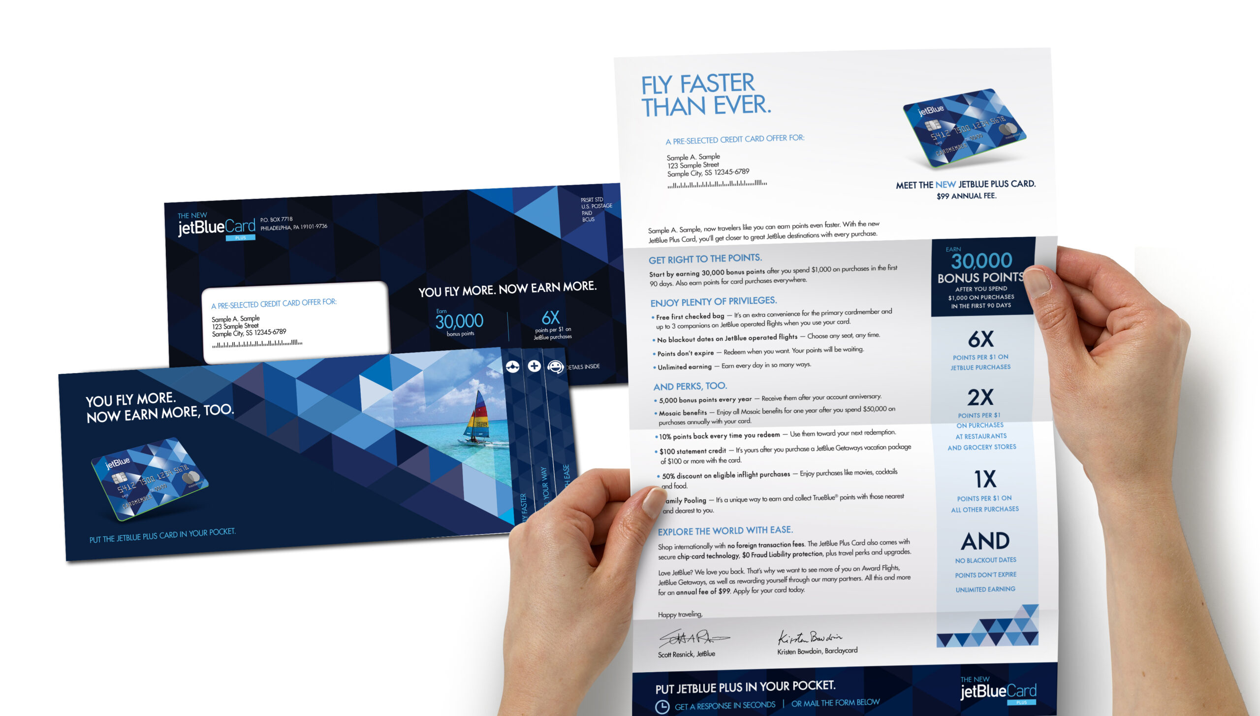
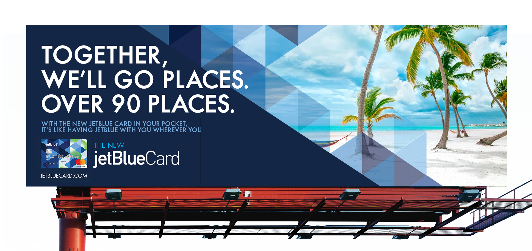
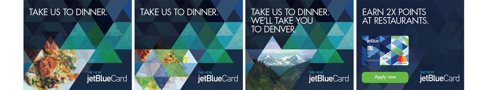
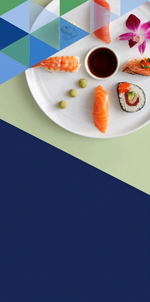
PROJECT
JetBlue Card Direct Marketing Campaign
CATEGORIES: Direct Mailer, Banner Ads, OOH, Landing Pages
ROLES: Art Director, Designer
YEAR: 2015-2019
MORE JETBLUE, EVERYWHERE
Whlie develpoing the visual concepts for the JetBlue Card suite, our team had the opportunity to work on a variety of projects for the product. We established refreshing design language across multiple platforms, from print deliverables, out-of-home campaign to digital newsletters and social ads. They all had slight different marketing approaches, while still maintain a consistent visual language through out, elevated JetBlue Card's brand image.


DESIGN TAKEAWAYS
Over the years, I've had the opportunity to work on many projects and campaigns for JetBlue Card(Barclays), who's one of our team's major clients. From initially participating in strategic brainstorming and working on visual concepts and as a senior designer, to guiding on design process, present deliverables to clients and stakeholders, as an art director. I have witnessed how effective design solutions affected the market, addressed user’s needs, and helped stakeholders achieve their goals.
JetBlue CardDesign that helps you take off faster than ever.
Chase Home LendingMortgage journeys made appealing, engaging and simple.
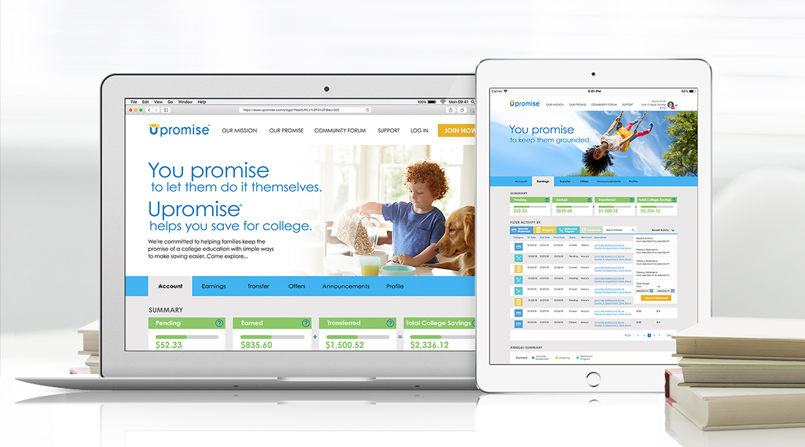
UpromiseRe-imagining a digital loyalty program
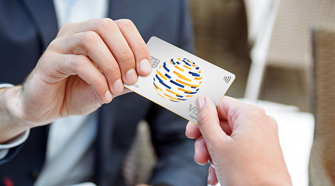
Visa InnovationCreating a premium experience for affluent customers